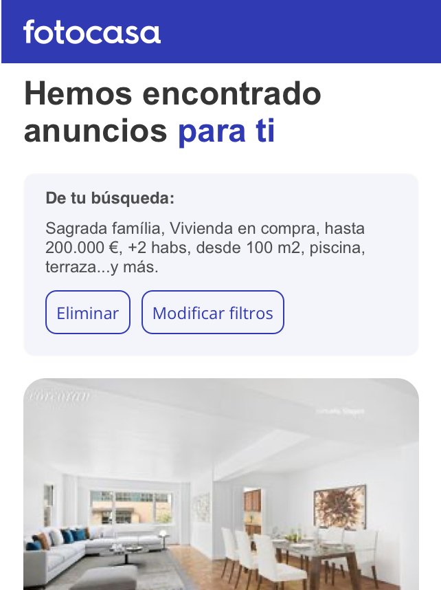
Fotocasa, emails
One of the most important real estate portals in Spain, seeks to create a perfect match between users who are looking for properties and the agencies that publish them on its portal.
Scope: Continuous improvement of email delivery and increase in conversion rate
Duration: 2 sprints
Tools: Figma
Role in team: UX and UI reserch
Problem
Due to the need to increase the conversion rate of the alert emails and also to help solve user pains, we worked on a solution for this considering that:
Increase the range of properties available to users
Facilitate the modification of alerts
Present the levels of property information with ease
Benchmark
When approaching the project we started with the study of the most important competitors in the market and how they carry out the delivery of email alerts, insights that came out were:
Considering the importance of displaying images of the properties
The clarity in the separation of the content presented in the emails
Clear possibility for modification and deletion of alerts
Definition
After the research, the proposal was designed; it was then tested and evaluated. Important points considered in the design can be seen below.
1__Definition of property card
The definition of the style of the property card was carried out, in which the presence of tags, the inclusion of the property price drop information and the number of photographs present in the property had to be considered, among other levels of information.
2__Card of other recommendations
To differentiate the cards from the properties in the email and to give a hierarchy to the information, another structure was defined for the cards of recommended properties that do not comply with the information saved in the alerts by the user. On the other hand, a title was defined at the beginning of the section with a larger size to give more separation from the section.
3__Other interactions
The design also included the proposal to integrate other interactions in the card, including the ability to share the property and save it in favorites. At the same time, in the gallery, it is proposed to be able to visualize the photographs by means of a carousel of images on the card.
4__Modification section
It can also be seen that at the top of the alert email, there is a section with information about the alert and the possibility to modify and delete it. By providing this information quickly at the top, it is easier for users to decide whether they want to continue with the alert or make another selection, which was measured to evaluate possible iterations.
Conclusions
It is important to highlight that in order to measure the success of this proposal we had to measure the points of contact, such as contact, phone number, share, and favorite, after this, we evaluated the possible iterations in the proposal and considered the technical difficulties for its implementation and development. A last point to highlight is that the technical complexity of the systems for sending emails is high, since Gmail, Hotmail and other systems do not support certain definitions of the UI, this point was of utmost importance in the project.


